Sunday, August 2, 2020

Creation and Collaboration: Wikis for Education

As a child of the 90s, one of my favorite things to do on our home computer was pop in the Encarta '95 CD-ROM and start clicking. Encarta was gorgeous: full-color photographs, embedded midi files, video clips. As I learned about Roman Empires, at the bottom of the article would be a link sending me to another page, then another and another, and
I loved clicking from one article to the next.  As a voracious reader, this was even faster than books and, more importantly, free. No trips to the library, no borrowing from teachers. All this information was here for the taking.

Just a few years later, Wikipedia burst onto the scene and changed encyclopedias forever. Encyclopedias were no longer expensive volumes or even software, but available to anyone with the internet. More importantly, anyone with internet access could add their OWN additions to the encyclopedia. In the decade since Wikipedia has become so ubiquitous, there are numerous off-shoots: Ballotpedia, an almanac of US politics; Wikibooks, a free textbook collection; and my personal favorite, Wookieepedia, a Star Wars encyclopedia. 

Although Wikipedia is perhaps the most well-known wiki, wikis were developed over 10 years earlier by Ward Cunningham who had the idea to collaboratively build things on the internet (1). With just a computer and internet access, any group of people could collaborate on a wiki. 

Anyone who's ever had to have something published or peer-reviewed knows what a languishing process publication can be. A wiki is instant. The openness with which wiki pages can be edited is also what contributes to its success. Everyone and anyone can see the editing process and make corrections or call out the original contributor as needed. To me, a wiki is the best part of the internet: open information and collaboration. 

Affordances

The site I'm choosing to discuss today, PBworks, has been around since the early 2000s and is used by many business and educational groups (2). The earliest versions of wikis required knowledge of markup language, but thankfully the process has become much more simplified. If you can edit a Google Doc, you can edit a wiki.  


I grew up with Windows 3.1 and the original Napster, so the homepage of PBworks looks familiar to me. I don't think it's as aesthetically pleasing as some other websites, and I could see my students perhaps pausing, but it is logically laid out. If you just read left to right, you can see the labels: Wiki, Pages, Users, and Settings. 

On the Frontpage are a VIEW and EDIT tab. Selecting Edit changes the page to look very similar to a Word doc or a blog post. As you type in the box and save, clicking back to the View tab shows the page is immediately updated. With PBworks, a student can be editing a live web page in under 5 minutes. 


Selecting Pages shows a list of pre-filled template pages that would work with an educator's account including syllabus and assignments. Editors can add pages here as needed and it can be organized into folders.


PBworks allows different types of users: page-level users can only access pages you explicitly give them access to; readers can view pages, but not edit; writers can view and edit pages; editors can view, edit, move and delete pages and folders; and administrators always can do anything on pages and folders. This is great for teachers because I can allow student access to just certain pages. 


The last tab, Settings, offers a little bit of customization. Because this is an educator account, I can also create classroom accounts that will automatically generate usernames and passwords if my students don't have email accounts. I can also add my students on the Users tab by simply copying and pasting email addresses. 

A few other features I like are the nested tables on the right side of the home page. The Sidebar can be edited like any other page. I can add links there, offer another navigation section, whatever I need.  I also really like the Recent Activity section, so I can see which of my users are contributing and what they worked on. It also has a built-in plagiarism checker which would be a boon in any writing course.

AP Lang Uses

A wiki would work very well with teaching argumentative writing, one of the main modes of writing my students do throughout the year. I could create a page with sample argumentative essays, allowing students to read and comment on what they notice after reading the samples. 

My student’s first argumentative essay is written in small groups. Using PBworks, students would have editing rights to the same page and create the essay there. As any teacher knows, often group work turns into a high achiever doing 90% of the work. With PBworks, I could actively see which students contributed and what their contributions were. 

When students are ready to write their own arguments, they could have access to their own wiki page. It would be a really effective addition to the writing process because instead of arbitrarily setting up deadlines (rough draft 1, rough draft 2, final draft) other students could be fact-checking and offering editing and revisions throughout the writing process. Furthermore, publishing their essays to PBworks would add an authentic audience. 

Learning Theory/Distributed Cognition 

As a constructivist, a wiki would allow my students to build their knowledge through authentic experiences. Instead of writing to an audience of one, students will be collaborating and writing to a worldwide audience. By reading each other's arguments, they could begin applying effective argumentative tactics to their own writing. I am no longer the one directing all information to them; they are curating their own experiences and knowledge. 

A wiki also offers many opportunities for distributed cognition. Right now I control our LMS, Canvas. Using a wiki as a shared space for my class would allow students to contribute a page of shared notes. Students could collaborate on mnemonic devices that help them remember the rhetorical situation.  I think most teachers long for students to take ownership of their learning, and a wiki seems like a great way to build that ownership. With a wiki, students could have an authentic voice in the classroom and be able to add information to the class site that they want and need. 

Conclusion

In 1994, my dad downloaded an image from a NASA Jet Propulsion Lab server of the Shoemaker-Levy comet crashing into Jupiter. He showed my mom, then downloaded it onto a floppy disk and took it to work where he gave it to a fellow science nerd. A week later, my mom called him into the living room where the 10 o’clock news was showing that very same image from the JPL. My dad looked at my mom and said, “We don’t even need them anymore. We make the media.”

What makes Wikipedia different than my beloved Encarta CD?  In its final version, Encarta consisted of 62,000 articles. Wikipedia currently contains 6.1 million articles...just in English. With wikis, there are no more gatekeepers to information. Now, we make the media.

Sunday, July 26, 2020

Wait! Somebody Has Probably Done It Better

As a first-year teacher, and the only 8th grade English teacher at my small 2A school, I remember the school secretary taking me aside and whispering conspiratorially that her best friend, my predecessor, had left me the notebook of E-V-E-R-Y-thing she taught. My joy was short-lived as she handed me a binder with the 8th grade ELA TEKS printed and highlighted.

Bless her heart.

I knew the TEKS. I had printed and highlighted them myself. What I didn’t know was how to put it all together. Students should “write responses that demonstrate understanding of texts, including comparing sources within and across genres.”(1) That sounds great, but how do I put that into practice?

I had 10-year-old textbooks and 115 students showing up in a week. So, I turned to the internet and found my saving grace-Teachers Pay Teachers. I spent hundreds of dollars over the next few years as I tried to balance being a teacher and new mom. I don’t begrudge the teachers who sell on that site, but I do resent spending my own money on curriculum that should have been provided. Even worse, sometimes I would buy resources that didn't fit what I needed it to do or were inaccurate.

Thankfully, in the decade I've been teaching, I have gotten pickier and more resourceful about the sources incorporated in my classroom. Even better, I have found there is a plethora of quality content that doesn't cost anything.

KHAN ACADEMY

One well-known online resource is Khan Academy. Khan Academy began in 2005 with Sal Khan creating tutorial videos for his cousin. In the 15 years since, Khan Academy has grown by leaps and bounds, fulfilling their mission statement to “provide a free, world‑class education for anyone, anywhere.”(2)

I first heard about Khan Academy because our math department would utilize their videos for sub plans, extra practice, or remediation. Early on, Khan Academy didn't offer a whole lot of ELA content, but that has changed. 

Sign up is easy for teachers, students, or parents. One nice thing about Khan Academy is the inclusion of teacher training. They really want teachers to fully utilize their site and have tons of built-in training.

I was very excited to see that Khan Academy had officially partnered with College Board in AP practice. However, a closer look showed me one course suspiciously missing. . .


Although Khan Academy does not have ready-made modules for AP Lang, they still have quite a bit of content that could work in an ELA classroom. Khan Academy focuses on Mastery learning so students have to get a certain percentage right to unlock the next stage in the learning practice. I’ve found this type of gamification really effective. It's low-stakes enough to not put a lot of pressure on students and puts the onus on learning, not a specific grade. The grammar module will be perfect for this.  Many of my students are proficient in grammar, but the ones who aren't could work at their own pace to achieve mastery.

I also searched for the types of writing that I teach in AP Lang. I was very excited to find videos rhetorically analyzing pieces we already read in class like Lincoln's inaugural address and the Federalist Papers. Close reading is a skill that we work on all year, and I often model close reading on an overhead camera in my classroom. With virtual learning, it's really nice to have these videos already made so that students can watch the process of rhetorical analysis through annotation.


All in all, Khan Academy is a much more robust resource than I originally thought, and I look forward to incorporating it into my classroom.

MIT OPEN COURSEWARE

Like Khan Academy, MIT Open Courseware (OCW) operates off the idea that knowledge should be free and education available to everyone.  This amazing offering from the Massachusetts Institute of Technology has made over two thousand FULL college courses available. This program costs 2.7 million dollars to operate a year and depends largely on donors. Professors donate 5 to 10 hours per course offering, and MIT has a full-time staff of 12 to operate OCW. (3) 

The discovery of this website has been a boon in teaching APLang. A quick search of writing courses reveals almost 150 different classes available.

I chose "Writing and Rhetoric: Rhetoric and Contemporary Issues,"a class that would be comparable to AP Lang. It begins with a course overview page. (4)

The Syllabus tab includes everything needed to teach this class for yourself. I remember as a new teacher trying to come up with class policies, dividing up the percentage points for grading, trying to decide how many texts per week were too many or too few. The syllabus has all of that.

The next tab is Calendar, and true to name it outlines the semester’s work. I find the Reading tab even more important. It is set up like the Calendar but includes hyperlinks to the readings covered in the classThe Assignment tab covers all the types of assignments outlined in the calendar.  Again, as a new teacher, I struggled so much with how to format assignments or how long essays should be. This tab covers many of those questions.
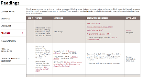
The last tab is Related Resources and it has handouts, writing resources, and links to other sites that might be helpful in finding texts or managing the class.


TERMS OF SERVICE

Khan Academy has a 17 Page terms of service agreement. To me, the key was that users have “a limited, non-exclusive, non-transferable, non-sublicensable, revocable license to download, install, view and use the . . . Content. . . solely for your personal, non-commercial purposes.” (5)

MIT OCW operates under a Creative Commons license that allows users to “copy and redistribute the material in any medium or format and. . . remix, transform, and build upon the material. . . [as long as]you must give appropriate credit… and [do]not use the material for commercial purposes.” (6)

Essentially, both sites allow the liberal use of the materials for educational use, but users may not use any material found on the sites in any commercial venture.

CONCLUSION

In 12 years of teaching, I’ve been given seven different textbooks. I’ve survived three different sets of state standards, C-Scope, and scopes and sequences with neither. With just Khan Academy and MIT OCW, I can easily create high-quality courses for my classes. Better yet, I don't have to pay for or create them and can save my energy for feedback, relationship building, and actually teaching.

Monday, July 20, 2020

Edmodo VS Canvas

Canvas and Edmodo are both easy to use course management systems that teachers can utilize in blended, flipped, or digital learning.

In both systems, creating an account as a teacher is as easy as having an email address. Once you have created your account, you can add classes and begin setting up your online course.

Canvas and Edmodo offer many similar features that make it appealing to teachers. Teachers need to create content for students to engage with and teachers need to be able to assess students. Students should be able to interact with each other and the instructor. Students need to keep up with assignments and turn those assignments in. Edmodo and Canvas tackle these issues in similar ways.


As a student, the Edmodo layout is direct. Classes are listed on the left and a built in planner on the right hand side keeps track of coursework.
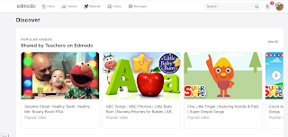

One fun aspect of Edmodo is the Discovery tab. For students, this tab offers up educational games and apps that work within Edmodo.

This tab for teachers is an instant learning community where teachers can find lessons and add-ons for Edmodo.
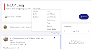
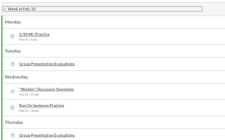
From a student standpoint, Edmodo is easy to navigate. Students can log-in with their Google email address, and OneDrive and Google Drive are integrated into the aptly named Backpack. Edmodo has clearly made many improvements since I used it years ago. 

From a teachers perspective, Edmodo is easy to use as well, but in my opinion, Canvas wins in the organization department. In Edmodo, everything is in a stream (much like Google Classroom). You can filter by type of assignment, but that can be cumbersome, especially if a teacher is posting multiple things per day. 
     

Canvas is organized into Modules. Teachers have the flexibility to set up these modules by week, by unit, or however they see fit.


Modules have arrows at the bottom that allow students to navigate from one page to the next. This allows a teacher to curate the learning experience from formative assessment, to learning activities, to summative assessment.

I created an Edtech module for new students to my school. It begins with a pre-test to determine their starting point. They then navigate through pages that explain different tech available to them. Unlike traditional lectures which depend on a student's ability to remember and/or take notes, students can return to the material at any time. The affordances of online delivery allow for deeper learning.

Both Canvas and Edmodo deliver content and allow students to have a more tailored learning experience. I appreciate that my district pays for Canvas, but for a free course management system, Edmodo is a fantastic option.

Sunday, July 12, 2020

Google Apps in the ELA Classroom
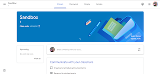
This week’s design experiment was somewhat bittersweet. As a long time Google fan, I used Google Classroom years ago when my district was trying out different learning management systems. For a variety of reasons, my district chose Canvas (which I've grown to love) but in some ways, revisiting Classroom was like coming home. 


Using Google Classroom

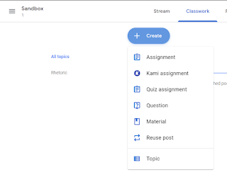
The affordances of Google Classroom make it easy for even non-tech savvy teachers to use. They have added many features since I last used Classroom, such as topics and Kami assignments. One of my biggest critiques with Google Classroom is that organization can be overwhelming, but adding topics and using icons to differentiate between materials is a great step in aiding teachers in the organization of the online classroom. Google Classroom has changed the face of online learning with Classroom and its suite of apps. 


For many, when they hear Google, they think email and they think Docs. It’s hard to believe Google Docs and Slides came out almost fifteen years ago. As a broke college student, I was a very early adopter of Google Docs because my nerd husband ran Linux on our home computer and we couldn’t use the ubiquitous Microsoft Office. As an English student, I had to use type papers and loathed OpenOffice, so Google Docs was a godsend. 

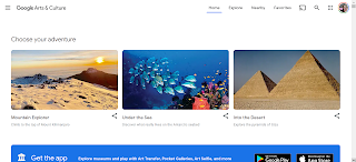
In the decade and a half since Google Docs, Sheets, and Slides appeared, Google has continued to explore apps. One Google app that I have underutilized is Arts & Culture. This app is the partnership between Google and cultural organizations to bring images and videos to the public. It's almost 10 years old and has grown from an initial 17 partners to 151 museums.1 It is beautifully designed and well-organized into sections including Choose Your Own Adventure, Music + Art, and Explore. 

Google Arts & Culture


One of the 10th grade standards in Oklahoma is to analyze the intended rhetorical purpose in written, oral, visual, digital, and interactive texts to create new understandings. When I'm teaching rhetorical analysis, we often begin with visual pieces as an intro to rhetorical analysis. This year instead of me choosing the piece, I'll allow students to use Google Arts & Culture, choose a museum, and then choose a piece to analyze. 

In Learning to Choose, Learning to Learn, Mike Anderson identifies student choice as one method of fighting student apathy. My students might never be excited about rhetorically analyzing artwork, but giving them the autonomy to choose a piece to analyze will hopefully tap into some ownership of the assignment. The majority of my students will probably never be able to visit the museums curated on this site, so the content (rhetorical analysis) and the pedagogy (student choice) will be greatly augmented by Google Arts & Culture. 

Google Jamboard


Another Google app I'm in love with is Jamboard. Jamboard is much newer and originated as hardware that allowed people to collaborate together on a 55” screen. Although I don’t have the hardware, the software is available to any Google user. When I first started looking at it it seemed similar to Slides, but after using it a bit, it is so much more than that. Jamboard is developed for collaboration. It's a Google app, so it's well designed and streamlined, with affordances that make it easy to use. 

One standard I teach is applying components of a recursive wring process for multiple purposes to create a focused, organized, and coherent piece of writing, so I'm always looking for a way to get students to prewrite. Especially at the beginning of the year, I focus a lot on the thinking that goes into an essay much more than actually writing full-length essays.

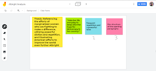
After my students have read a piece, I'd like to put them in pairs to brainstorm an analytical essay, using sticky notes in the Jamboard to create the shell of an essay. After I have looked at their prewriting to make sure they're on the right track, students can add frames and spread those sticky notes across each frame. Jamboard allows outside images to be inserted, so instead of having students write the entire essay, they can create a graphic essay, a layer of complexity made easier through Jamboard. As a constructivist, I use often use prewriting and graphic essays to scaffold writing. Having done prewriting with actual sticky notes, I can’t wait to use Jamboard! Especially when I think about potentially teaching online in fall, Jamboard offers virtual collaboration and infinite redos. 


Although I’ll never forgive Google for taking away my beloved Reader, I’m still a Google fan and I’m thankful that my students have access to so many opportunities for learning through Google apps. 

RIP Reader
Gone But Not Forgotten

_________________________________________________ 

1. Knowles, Jemillah. "Google's Art Project grows larger with 151 museums online across 140 countries". TNW Google Blog. The Next Web. Retrieved 6 April 2012.

Sunday, June 28, 2020

Creative Tools in the English Classroom

As an elder millennial, I grew up around technology. I had teachers incorporate it very well, I had teachers use it as a crutch, and I had teachers refuse to use any non-mandated technology. Shifting from learner to educator, I was dismayed but not surprised to work with educators in a similar pattern. Tech use only increased, and yet many teachers seem almost proud to shun technology in the classroom. Thankfully, I think the Luddites are slowly coming around (or retiring), and just in time. Educational apps are a huge market, and there are so many apps and websites designed to creatively engage students in authentic learning.  

This week, I dove into creative tools-anything that allows a student to create or produce. A quick Google search brought back over a hundred million sites, and it was fun to look through lists and narrow down a few I thought would work best in the high school ELA classroom. 

Creative Apps

The first app I looked at is Mindomo. As an English teacher, I am forever trying to persuade my students to prewrite. For some reason, adolescents don’t want to take the time to write, you know, before they write. However, I have found that letting them fill out graphic organizers seems to take the sting out of drafting. 

A concept map (or graphic organizer) is a pictorial representation of ideas, especially useful in getting students to grasp abstract connections. Research dates back to at least 1989 regarding the numerous benefits of concept mapping including encouraging a group to stay on task; allowing a student-developed framework entirely in the language of the participants; showing major ideas and their interrelationships; and even improving a groups cohesiveness and morale1. Wanting to find a concept mapping website or app that would work in my 1:1 classroom, I found Mindomo. 


Pros:

Cross-platform mind mapping app. Using it on my Android phone was surprisingly painless. Single sign-on so users can use their Google login. Dozens of templates from essay planning to goal setting. Built in collaboration. Free account limits you to three mind maps.

 Cons:

On the downside, sharing mind maps between devices was clunky, requiring me to access my downloaded files instead of just opening in the app when selected. Teacher edition starts at just $3/month and offers perks like LMS integration and unlimited mind maps.

iMovie

I am an Android user, but I borrowed an iPad to play around with iMovie. A popular idea is having students use iMovie to record book trailers over their reading. I like creative options for discussing reading, but many creative options for book presentations are all flash, no substance, so book trailers sound intriguing. 


Pros:

Even without being an Apple user, iMovie was dead simple to use. My 14-year-old was able to make a 30-second book trailer in less than an hour. The trailer templates that came with the app were engaging, and I could see students having a lot of fun with it. The trailer templates especially made polished, professional-looking videos. 

Cons:

It’s only for Apple. Our school has an iPad cart, but that’s kind of a hassle. I couldn’t see a way for students to easily collaborate, even across Apple devices, so they would have to share a device. There was some difficulty in getting pictures to upload, and the only otion we found to share was via Youtube which my school does not allow.

Adobe Spark

Adobe Spark is a new-to-me tech tool. My school introduced it in the fall, but I didn’t make time for it until now. This tool allows the user to create videos, infographics, social media posts, almost any visual imaginable. It’s an aesthetically pleasing website, and I appreciate the easy to navigate tools. This is the tool I’d like to further explore. 


Pros:

It’s easy to use. Free for educators. It includes tons of templates. It also has already developed lesson plans to help teachers incorporate it in class. Kids can log in with their Google credentials. Designed with Chromebooks in mind.  

Cons:

I don’t see any immediate downsides. I emailed a friend who used this tool extensively last year. She had one issue where a student deleted his entire graphic and could not get it back, but I think that’s a risk with a lot of apps/tools.

Adobe Spark 

Adobe Spark is very intuitive. There are easy to follow video tutorials, extensive FAQs, but even skipping those, the website makes it very easy to create. The plus button allows you to add, each option is labeled with words and icons, and the site is streamlined. I feel confident the majority of students familiar with cell phone apps or basic web usage will be able to easily navigate the site.

One way I would like to use Adobe Spark next year is with getting-to-know-you presentations. One standard I address is to “make strategic choices in a text to address a rhetorical situation.” The rhetorical situation is easy to define and hard to explain; introductions are a low stakes way to begin analysis. Furthermore, as a constructivist, introductions begin the student-teacher relationship that will guide our year together. 

Adobe Spark will allow the student to create beautiful introductions. The rhetorical situation requires students to consider their audience (in this case, their peers and teacher) and speaker (what information about themselves do they need to impart) in order to establish their message (the values are they communicating). Adobe Spark offers many templates, so students can choose to do this assignment as a video, an infographic, or a post. They can add sound, text, or photos. Adobe Spark is as easy to use as Canva or Google Slides, but I find the layout much less overwhelming and more streamlined. I think the affordances and ease of use will help students focus on the task without getting bogged down in the creative side.

Introducing the rhetorical situation can be done on paper or with a variety of other tools, so this is really just an augmentation of a traditional task. To bump it up to redefinition, I would like to have students post their introductions on their blog/website and invite other students to analyze their rhetoric. Adobe Spark makes it easy to create beautiful presentations, and adding an authentic audience to their work will also address speaking and listening skills.

Conclusion

When I first started teaching, my school in Texas was moving to iPads and it was a Very Big Deal for my Title One school in 2007. Many teachers in my building eschewed the technology completely or used it as a glorified word processor. One English teacher even wrote a grant to buy Bluetooth keyboards and mice. To be clear, her students did not request or need a keyboard, but she couldn’t imagine comfortably using an iPad to accomplish what she used a computer for, namely web searching and word processing. 

As an Android user, I was very trepidatious because of the unfamiliarity of everything Apple, but I knew my students deserved creative tools in my classroom. I think most teachers would agree that engaged students learn more, so why wouldn’t I use everything at my disposal to foster student engagement? My comfort should not take precedence over learning. My classroom is not about ME. My class is about student learning.

Furthermore, I think nearly every student benefits from creative applications. While I still require my students to take handwritten notes, I still use board games in class, I still throw out a flashcard or two, I also realize my students have pocket computers with computing power almost unimaginable 50 years ago. Content should always be the focus in our classrooms, but there is no reason to only use teaching methods from 25, 35, 50 years ago when there are so many engaging ways to teach the same content. 

Forbes reported that employers seek traits such as working well on a team, thinking independently, being a problem solver, and being happy to learn new things2. Creative tools foster all of those traits, and I owe it to my students to incorporate them into my classroom.

_________________________________________________________________

Sources:

1: Trochim, W. M. (1989). An introduction to concept mapping for planning and evaluation. Evaluation and program planning, 12(1), 1-16.

2: Ryan, Liz. (2016, Mar 2). 12 Qualities Employers Look For When They're Hiring. Forbes. https://www.forbes.com/sites/lizryan/2016/03/02/12-qualities-employers-look-for-when-theyre-hiring/#1451d8652c24

Sunday, June 21, 2020

The Affordances of ePortfolios
As a learner, I remember very few essays I've written, and I remember even fewer quizzes and tests I ever took. There are some standouts: a big paper I wrote over Chaucer, the rocks and minerals test I took in geology, an especially horrific test that had me matching poets and first lines of 75 plus poems. But by and large, from 18 years of education, I remember a small percent of the assignments that made up said education. Certainly my education is worth more than the sum of its parts, and I retain the skills I gained as a reader and writer, but when I think of how much time I spent making flashcards, reviewing, and completing assignments, I can't help but think it could have been done in a more meaningful way. 


As I looked through portfolios this week, I remember different semesters of college where I would have to collect work, but there was never an overarching purpose. It felt like each teacher was going rogue. Although I found value in the portfolio assignments, because they were only done intermittently, they never really achieved what I would think of as the full goal of portfolios.


Defining Portfolios


Loyola University defines an ePortfolio as 


a digital collection of work over time that showcases skills, abilities, values, experiences, and competencies through a broad range of evidence-based learning. An ePortfolio may include a variety of artifacts - or relevant documents and media files - that provide a holistic representation of who you are, personally, professionally, and academically.


According to this definition, a teacher could use many different assignments as a type of portfolio. I think of giving my students journal prompts throughout the semester or having them write a beginning, middle, and end of the year assessment. But to me, the last part of the definition is most important: a holistic representation of who you are personally, professionally, and academically. Haphazardly assigned writing prompts or the portfolios I completed as an undergrad do not fulfill this purpose. They were all pieces and parts, but never came together as that holistic view of me as a learner or as an educator.


Affordances of ePortfolios

Last week, I discussed blogs and asserted that any student familiar with internet access and a passing familiarity with word processing software can maintain and update a blog. EPortfolios can be nearly that simple or can be built from scratch including the coding to create the web page. With websites like Wix and Weebly, the affordances of ePortfolios make it a great tool for student learning.

Wix and Weebly have drag and drop tools that allow students to easily customize their website, and they also have a myriad of editable templates. One potential drawback to these websites is that they are ad-driven, and to remove the banner requires payment. Additionally, some school districts may block them as social media.


Another great option is Google Sites, free with any Google account. If you go this route, Google also provides a gallery of templates to begin, including a portfolio option. An embedded tour guides the creator in adding elements and eventually publishing the site.

Wikis are another option for portfolios. One main way Wikis differ from blogs is that they allow groups to maintain the same site. Of course the ubiquity of Wikipedia ensures that everyone's heard of a wiki, but in my experience few of my students have ever used or edited one. When I first began teaching, my students used Wikispaces to create websites but that site was shut down some time ago. PBWorks is another collaborative website that has undergone such a dramatic change it doesn't even look like a traditional wiki. That's not a bad thing because, to me, one of the main drawbacks of wikis is the somewhat dated appearance and lack of usability. However, with Wikispaces and PBWorks gone, I don't see myself using or recommending wikis.


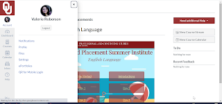
Another interesting e-portfolio option I found is within Canvas, a learning management system very popular in Oklahoma. Our campus has been using Canvas for a couple of years, but only when I became a student at a summer course did I see the portfolio option.


It's very easy to create the portfolio within Canvas. It begins with a brief overview of what an ePortfolio is and includes a “Getting Started” wizard to help you begin. My students are very familiar with Canvas, but I would hesitate to recommend this option because you have to have a Canvas account to access it. If an ePortfolio is designed to showcase lifeline and lifelong learning, I feel it's important that it's hosted somewhere with the most access available.


Google Sites have come a long way in the last few years and are really as simple as Wix and Weebly. It's a very clean interface with a robust help and FAQ section. Pluses to a Google site is familiarity with the brand, the majority of students will have a Google account, and it's free. One negative would be ensuring that students create the site under a personal email. Our students have Gmail addresses that go away after they graduate so they would need to use personal email addresses that are difficult to access at school. For my personal ePortfolio, I'm going with Sites. I'm a big fan of Google tools and think it has the look I want combined with the ease my non-coding self requires. ***


ePortfolios in APLang Class


As a writing teacher, having students keep an ePortfolio would be a great addition to my course. I struggle in AP Lang with midterms and finals because multiple choice tests don't feel like an accurate representation of what my students have learned. However, assessing full-length essays isn't always possible in the last couple of weeks of a term either. I feel like ePortfolios are the best of both worlds. They're a much more authentic assessment of what my students have learned and add the authentic audience that I so value in blogging. I think blogging has a place in my classroom as well, especially as a reflection piece. But I really like the idea of incorporating portfolios as an authentic assessment of my students.

APLang centers around three types of writing: rhetorical analysis, argument, and synthesis. I would like my midterm and final next year to be an ePortfolio with one sample of each type of essay. Having students curate their writing pieces throughout the year would probably just be augmentation on the SAMR model. I'd also like to add a visual component where students explain which pieces they choose which would bump it up to at least modification. I intend to model the different portfolio tools I've looked at, and then allow the students their choice of what site to use.


***There are many paid options for ePortfolios, but as an underpaid public school teacher, I focused on the plethora of free options.

Sunday, June 14, 2020

Affordances of Blogging

At its most basic, a blog is a free, online publishing forum. It can be run by one person or a team and can have any infinite number of topics. Many blogs are centered around a main topic like fashion or teaching. Blogs aren't usually as media centered as glogs or vlogs, focusing on the written word, although writers certainly use videos or pictures to augment posts. Posts are drafted in essentially an online word processing document and may be published immediately or scheduled for any time the author chooses, while adding tags to posts allows readers to filter entries. Wordpress, Medium, and Blogger make blogging easy and free to begin and blogging is also a common option on website builders such as Weeby and Wix. Blogs include a commenting section (that can be turned off), but the discussion is typically more one-sided than discussion boards or social media.

As a learning tool, blogging offers the student the opportunity to become a published author. This affordance drives every aspect of the blogging experience, from designing the page to proofreading for an actual audience to collaborating with other bloggers. This desire to produce quality blog/vlog posts for an authentic audience is potentially intrinsically motivating although the grading aspect and commenting/liking posts provides extrinsic motivation as well. The familiarity of blog platforms is another affordance that makes it easy to use. Even if it’s a new technology, the on-line writing process looks similar to the more familiar Google or Microsoft Word doc.

Looking at different blogging platforms helped me better refine my idea of what I wanted in a blog. As a creator, I found the Wix interface distracting with editing toolbars on the left, right, and top of the screen. Weebly has a more clean interface, with a scrolling left toolbar that has editing tools. Features like photo galleries, contact forms, and embedding videos make blogging on these websites a more robust experience than Blogger, which is just about the posts. For students, Blogger comes free with a Google account and requires minimal set-up.

Potential Uses

As an English teacher, blogs are a natural fit. Unlike social media posts, there is no character limit on a blog post, lending itself to thoughtful, reflective responses. Because independent reading is a standard for K-12 in Oklahoma, it would be easy to have my students create a blog to do reading reflections. I could give a list of possible reflection topics like making textual connections (text to self, text to text, and text to world) and if I ask students to include links or pictures, I think creating a blog post would be the augmentation level of SAMR.

Allowing students to easily read and comment on each other's work would be an enhancement on the traditional reader response although asking students to discuss their reading is relatively low on Bloom’s. A more transformative assignment would be have students add a recording to their responses, like with a Flipgrid. After blogging the textual connections, students could add a video with a 1-5 minute book review and then comment on each other’s videos. Adding the evaluative element would level up the complexity of the task, and if I curated the videos, it could act as ongoing student-led book talks. I often recommend books to students, but I would love it if they could take ownership of recommending and finding books for each other.

Potential Drawbacks

Some schools block blogging platforms as a social media and the potential for spamming/trolling comments. Also, keeping up with 100+ blogs could be cumbersome in addition to a teacher's normal workload. One site I found, EduBlogs, is designed to make classroom blogging tenable. Teachers have a dashboard that updates with each new blog post. The dashboard tracks comments and activity and lists classroom blogs in order of last activity. Students still create their own blog and can personalize it, but EduBlogs allows teachers to not be dragged down by minutiae of checking so many pages.

Final Thoughts

I often have students reflect on their reading, usually as a short written response in class. Blogging responses adds the publishing element of the writing process that is often left out. Writing for an authentic audience typically ensures students will complete the work with more fidelity, especially if they know their peers are reading. When we have class discussions over independent reading, it’s often the same few students contributing. Blogging would give every student a voice, and by requiring students to read/comment on each other's blogs, they will be exposed to different responses that we might not have time for in class. Blogging marries an authentic, real-world audience and building a life-long habit of reflecting on reading/events/thoughts in a way that in-class assignments cannot do. I’m very excited to integrate EduBlogs into my classroom in fall!